
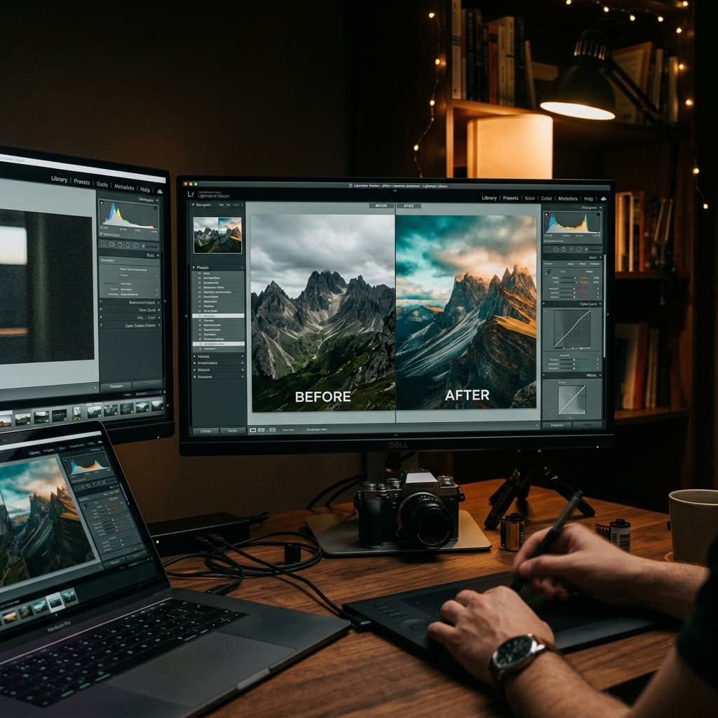
Film Look Lightroom Presets: Free Pack with Build Notes
Why Film Emulation Presets Still Matter
TL;DR: To get an authentic film look in Lightroom, lift blacks on the Tone Curve to soften shadows, shift greens toward yellow in the HSL panel, add fine grain (+25 Amount, 35 Size), and apply film stock color science like Kodak Portra 400 or Fuji Pro 400H. Download 5 free pre-built presets below.
Digital cameras produce technically perfect images - accurate white balance, deep blacks, wide dynamic range. But that clinical perfection often feels sterile. Film stocks had character: Portra shifted greens toward yellow, Ektar punched reds to near-neon, and Tri-X crushed shadows with a grain structure that felt three-dimensional.
Film presets don't just add nostalgia. They impose a deliberate creative constraint on color and tone that makes your images more consistent and recognizable across a series. That consistency is what separates a portfolio from a camera roll.
What's in the Pack
Five presets, each modeled on a real film stock's color behavior. Every preset is available for Lightroom Classic, Lightroom CC, and Lightroom Mobile.
Preset 1: Warm Portra
Inspired by Kodak Portra 400 - the workhorse of portrait and wedding photographers for decades.
What it does:
- Lifts shadows to a warm cream (never pure black)
- Shifts greens slightly toward yellow-green
- Desaturates blues by ~15% to prevent sky dominance
- Adds a subtle orange cast to midtones
- Applies a light grain overlay
Build notes - the "why" behind each slider:
The shadow lift is the most important adjustment. Real Portra negatives couldn't produce a true black - the film base itself had an orange mask. In Lightroom terms, this means raising the Tone Curve's black point to approximately RGB(25, 22, 18). The warm color comes from the specific RGB offset: red channel highest, green slightly lower, blue lowest.
Preset 2: Cool Fuji 400H
Inspired by Fujifilm Pro 400H - known for its clean pastels and muted greens.
What it does:
- Shifts overall white balance toward cooler tones (~200K cooler than as-shot)
- Compresses the green-to-cyan range in HSL
- Lifts shadows with a slight blue-green tint
- Reduces highlight contrast for a softer rolloff
- Minimal grain (400H was remarkably fine-grained for 400-speed stock)
Build notes:
The cool-pastel look comes primarily from two HSL moves: desaturating greens by 20% and shifting their hue toward aqua by +15. The shadow tint (a pale blue-green in the split-toning/color grading panel) does the rest. Keep calibration at 0 - 400H's palette was subtle, and over-processing kills the effect.
Preset 3: Cinematic Teal & Orange
Not a film stock emulation - this is the Hollywood color-grading look used in blockbusters from Mad Max: Fury Road to Blade Runner 2049.
What it does:
- Pushes shadows toward deep teal (cyan-blue)
- Pushes highlights toward warm amber-orange
- Increases overall contrast
- Adds a slight vignette
- Desaturates all colors except orange and teal range
Build notes:
The complementary teal-orange split works because skin tones fall in the orange range, so they pop against teal backgrounds and shadows. In Lightroom's Color Grading panel, set Shadows to approximately Hue 200 / Saturation 25, and Highlights to Hue 35 / Saturation 20. The key subtlety: keep midtones completely neutral to avoid the entire image looking like an Instagram filter.
Preset 4: Black & White Tri-X
Inspired by Kodak Tri-X 400 - the most iconic black-and-white film ever made.
What it does:
- Full desaturation with custom channel mixing (not just a grayscale conversion)
- High contrast with crushed deep shadows
- Pronounced grain structure
- Slight highlight glow (simulating halation in bright areas)
Build notes:
A good Tri-X conversion is all about the Black & White Mix panel. Red channel at +20, Green at +40, Blue at -15 - this produces Tri-X's signature skin-tone rendering where faces have a luminous quality against darker backgrounds. The grain should be set to Amount 45, Size 30, Roughness 60 for a close match to Tri-X developed in HC-110.
Preset 5: Faded Slide Film
Inspired by expired Ektachrome slide film - the washed-out, dreamy look popular in vintage and fashion work.
What it does:
- Heavily faded blacks (higher shadow lift than Portra preset)
- Slight magenta-pink tint in highlights
- Reduced overall saturation with blue-leaning midtones
- Soft, low-contrast profile
- Medium grain
Build notes:
Expired slide film loses shadow density and shifts color. The fade effect is a steep lift in the Tone Curve's bottom-left region (blacks at approximately 20%). The magenta tint comes from a +8 Tint shift in the Color Grading highlights panel. Keep vibrance at -15 and saturation at -10 for the authentic faded feel.
How to Install
- Download the ZIP file (link at bottom of this article).
- Open Lightroom → Presets panel → Three-dot menu → Import Presets.
- Select the downloaded
.xmpfiles. - The presets appear under a "Prompt Muse - Film Pack" folder.
For Lightroom Mobile: import via the Lightroom desktop app and sync, or import the .dng files directly on mobile.
Customizing for Your Work
These presets are starting points, not finished products. Here's how to adapt them:
- Too warm/cool? Adjust Temperature first, then fine-tune in Color Grading.
- Too much grain? Drop the grain Amount to taste - or remove it entirely if your subject has fine detail that grain obscures.
- Contrast too high? Lower the Tone Curve's contrast by pulling the S-curve toward a flatter line.
- Colors too muted? Increase Vibrance (not Saturation) in 5% increments until the image feels alive without looking over-processed.
The build notes above explain why each slider is where it is, so you can make informed adjustments rather than random tweaks.

Written by S.Sandaruwan
Tested by experienced digital photographers and prompt engineers. Every AI prompt, camera parameter breakdown, and editing preset is rigorously benchmarked across rendering engines and physical hardware.
You Might Also Like
FLUX.1 vs Midjourney v7 for Photorealistic Portraits: Prompt Engineering & Lighting Comparison
An in-depth comparison of FLUX.1 and Midjourney v7 for photorealistic AI portraits. Explore camera syntax, lighting setups, skin texture parameters, and prompt engineering.
20 Cinematic Portrait Prompts for Midjourney v7
20 tested cinematic portrait prompts for Midjourney v7, grouped by mood, with sample renders and copy-paste prompt text for immediate use.
iPhone Portrait Mode Tips for Studio Quality Photos
Discover actionable iphone portrait mode tips to elevate your mobile photography. Learn edge separation, focal lengths, and post-editing depth control.
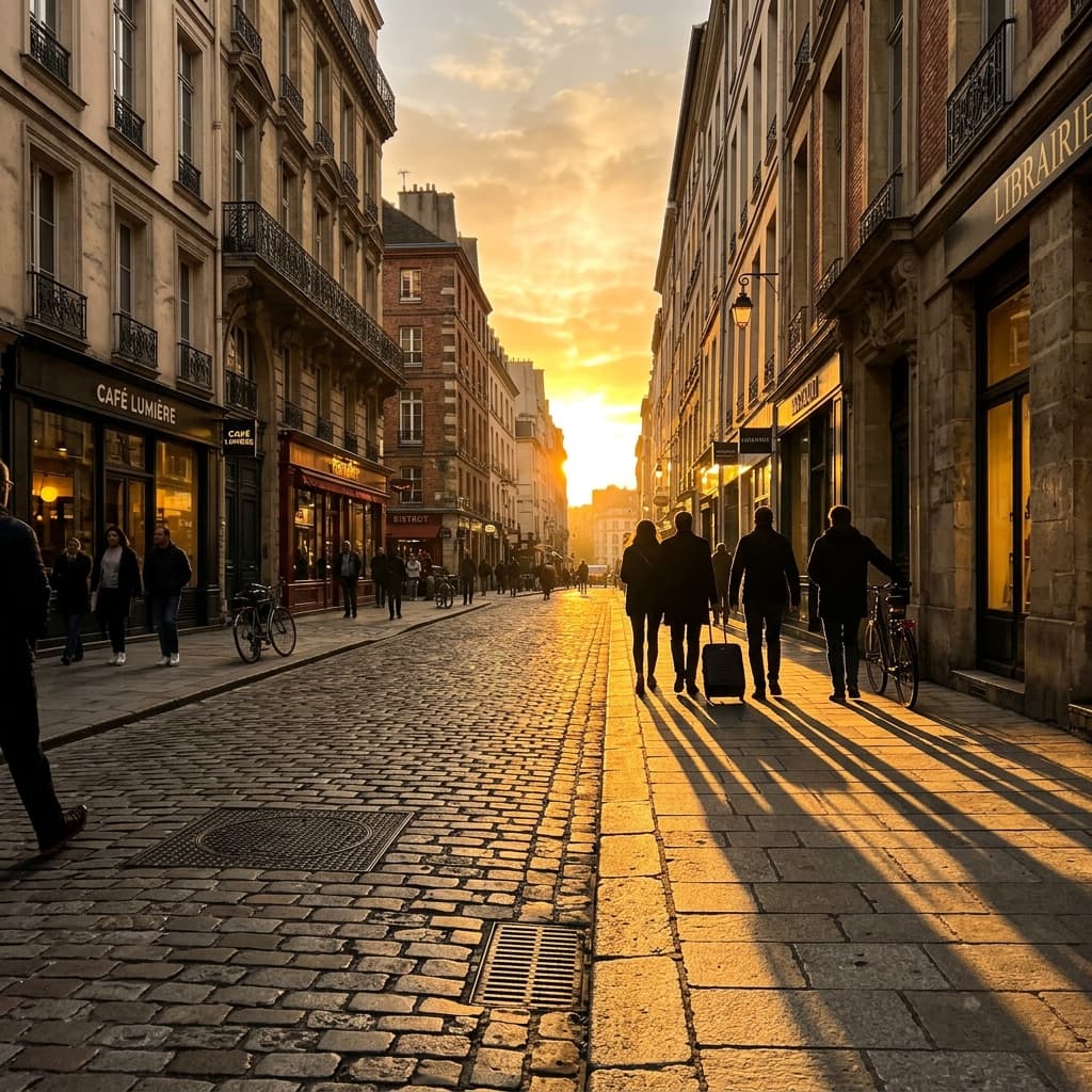
Golden Hour Phone Photography: The Complete Guide
Master golden hour photography with your smartphone. Timing, composition, exposure techniques, and editing tips for warm, cinematic shots.